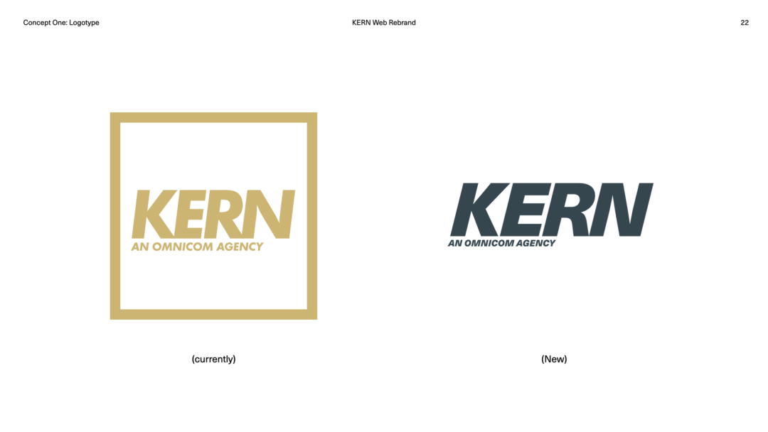
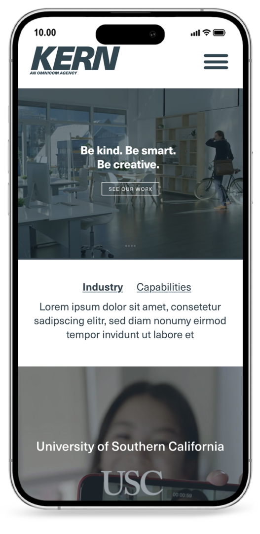
00%
Loading...

Kern Branding & Site Redesign

BACKGROUND

Rebranding a Creative Agency

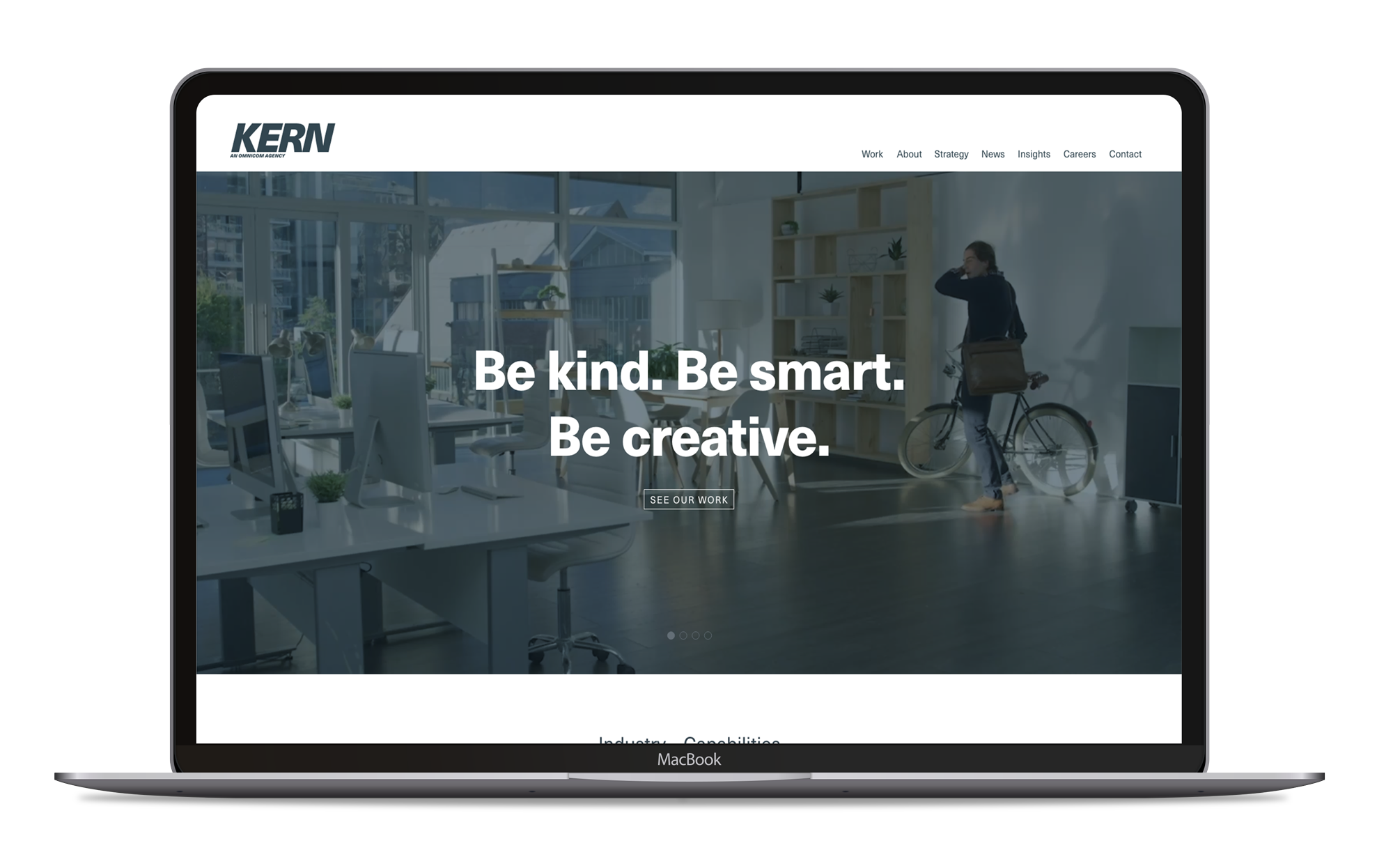
In 2023, Kern Agency (an Omnicom Agency) was exploring a new brand & site refresh. They were a CRM agency who has partnered with a lot of communications & media companies but also focused on the health industry. Working with the strategy team, we focused our brand refresh on serving the healthcare industry as a primary market.

Rapp, Kern's parent agency (also an Omnicom agency) had officially closed Kern Agency by the Fall of 2024 and the project was sunsetted in the Spring of 2024. 

Project Plan

01
Brandind Strategy
02
Design Research
03
Graphic Exploration
04
Concept Implementation


Presentation

Research / Strategy / Exploration

01  /  Intro
02  /  Brand Message
03  /  Brand DNA
04  /  Visual Anthropology
05  /  Visual Anthropology
06  /  Color Study
07  /  Color Study
08  /  Color Theory
09  /  Color Theory
010  /  Color Theory
011  /  Color Theory
012  /  Color Theory
013  /  Typographic Exploration
014  /  Typographic Exploration
015  /  Graphic Implementation
keyboard_arrow_left
keyboard_arrow_right

Color Palette

I used visual anthropology to explore a color palette that would align with an industry that Kern Agency had wanted to focus on (healthcare).

Charcoal Blue
#36454F
Champaign Pink
#f0d8cc
Roquefort Blue
#B3C7CC
Laurel Sage Green
#a9ba9d

Typography

We wanted to feel inviting, comfortable, sophisticated but not overly sophisticated. I felt Neue Haas Unica was a beautiful versatile typeface that was a modern take on sans serif that was its own.

Logo refresh

Because Kern Agency had already established its identity, we didn't feel it to be necessary to explore complete new logo designs. We wanted to modernize an already established identity. 

The first thing I wanted to do was take it out of the box. The box left a lot of unused space and felt constricting. Liberating it out of the box was (believe it or not) controversial internally, but eventually accepting of it. I also wanted to minimize the importance of it being an Omnicom agency. I also wanted to fix the kerning between the letters for better readability.

The refresh was well-received and much excitement was building up, but unfortunately Rapp had determined to move forward closing Kern Agency.